Why These Packages Exist
It’s always great to give back to a community. I especially appreciate it when someone provides a small thing that has a massive impact on my day-to-day workflow. Like an easy-to-use color palette for the institution I work at.
We’ve all been there. Your colleague has moved on or is taking a much-needed break, but a previous analysis needs updating. You have the analysis code but not the code to make the plots. Because you are pressed for time, you update the plots to the best of your ability, but they look slightly different from the other plots in the document or presentation.
MSUthemes – for R and Python – removes the need for people to create their own internal MSU colour palettes and reduces the barriers to updating colleagues’ analyses. Using these packages enables you to create plots with a consistent aesthetic and focus on the analysis.
These moments of friction add up - not just in lost time, but in the subtle inconsistencies that make collaborative work look less professional than it should. That’s why I created the MSUthemes packages for R and Python: to provide consistent, professional colour palettes and themes for Michigan State University and comprehensive colour support for all Big Ten Conference institutions.
The packages include MSU-specific palettes (sequential, diverging, and qualitative) aligned with MSU’s branding guidelines, use the Metropolis font in plot construction, and provide primary and secondary colour palettes for all 18 Big Ten institutions - making them ideal for multi-institutional comparisons and collaborative research visualizations.
The idea was sparked by the work of Andreas Krause, Nicola Rennie, and Brian Tarran. While the original RSSthemes package focused on Royal Statistical Society (RSS) branding, the MSUthemes packages adapt the concepts to fit MSU’s visual identity using the RSSthemes framework.
The MSU Colour Palette
Michigan State’s primary colors—Spartan Green and white—provide a strong foundation for data visualization. Creating a consistent color palette that works across both R and Python ensures your visualizations maintain brand identity while remaining accessible and informative.
R Implementation
Here’s how the MSU colour palette appears in R:
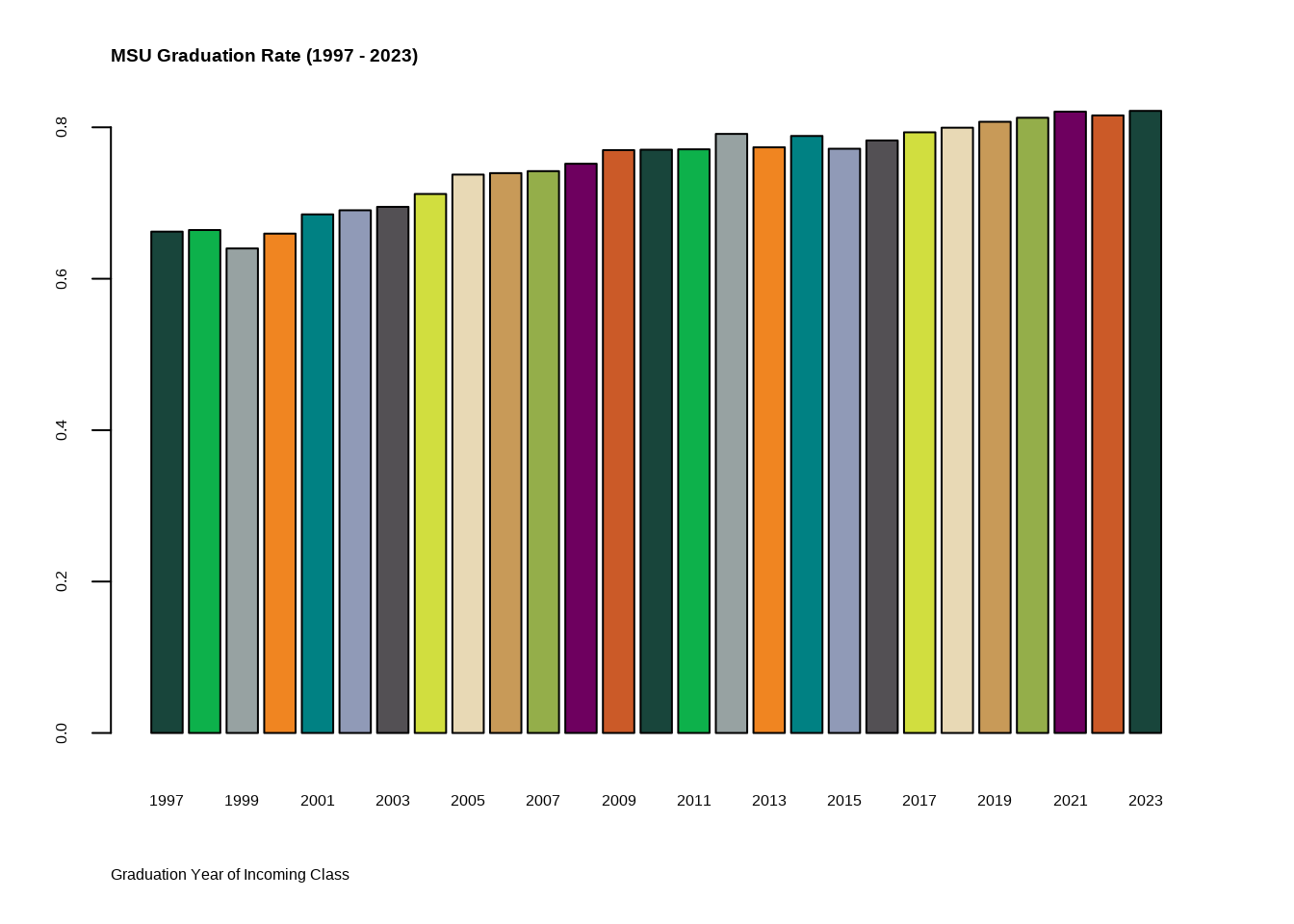
The palette includes not just the primary green, but complementary colours that work well for categorical and continuous data while maintaining accessibility standards.
ggplot2 Integration
For those working with ggplot2 (as most R users do), integrating custom themes streamlines the visualization process:
This approach allows you to create consistent, professional visualizations with minimal code repetition.
Python Implementation
Translating these themes to Python ensures consistency when projects span multiple languages or when collaborating with teams using different tools.
Grouped Comparisons
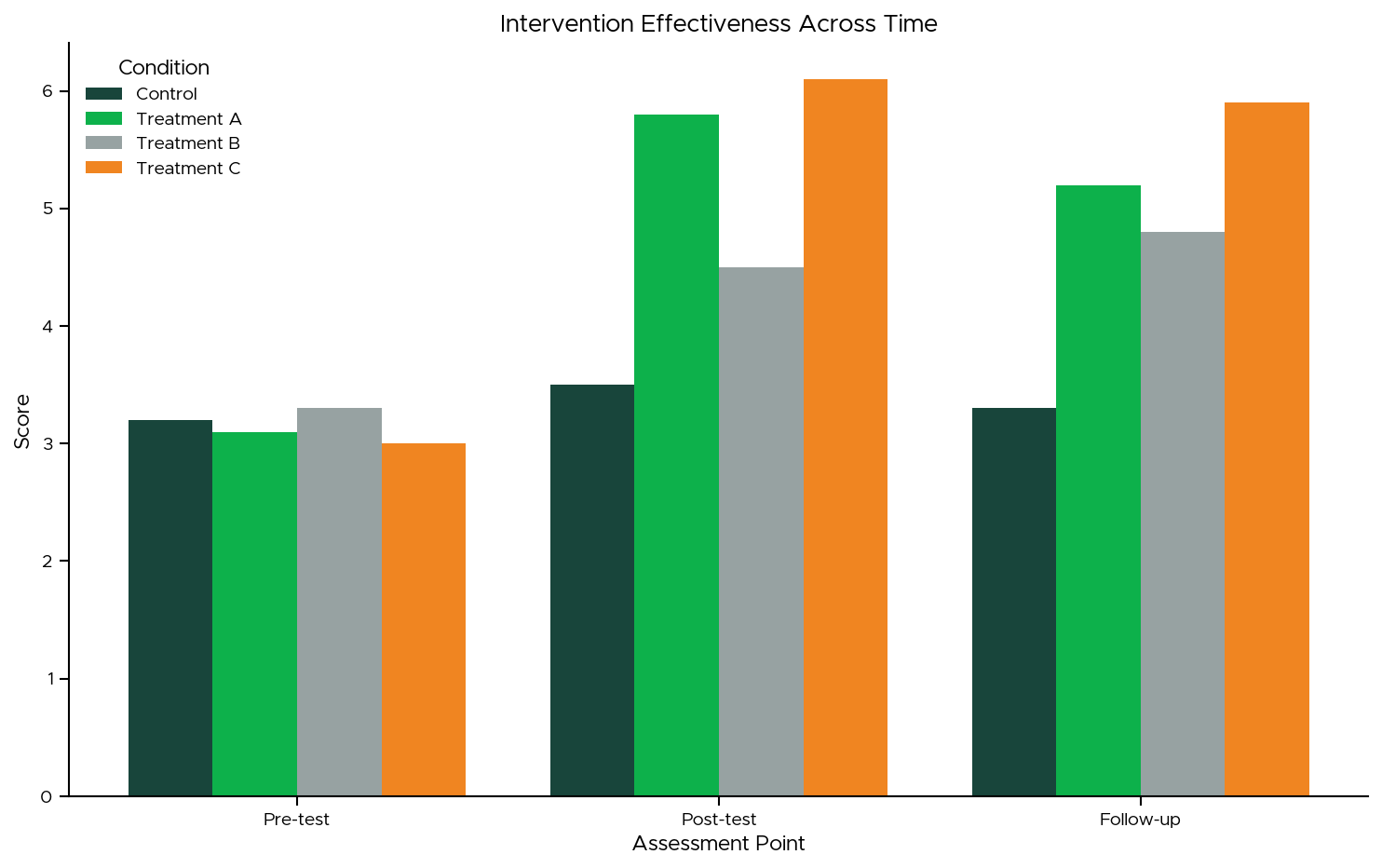
Python’s matplotlib and seaborn libraries provide flexible theming options that can replicate the R implementations while leveraging Python’s strengths in data manipulation and integration with other systems.
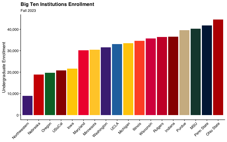
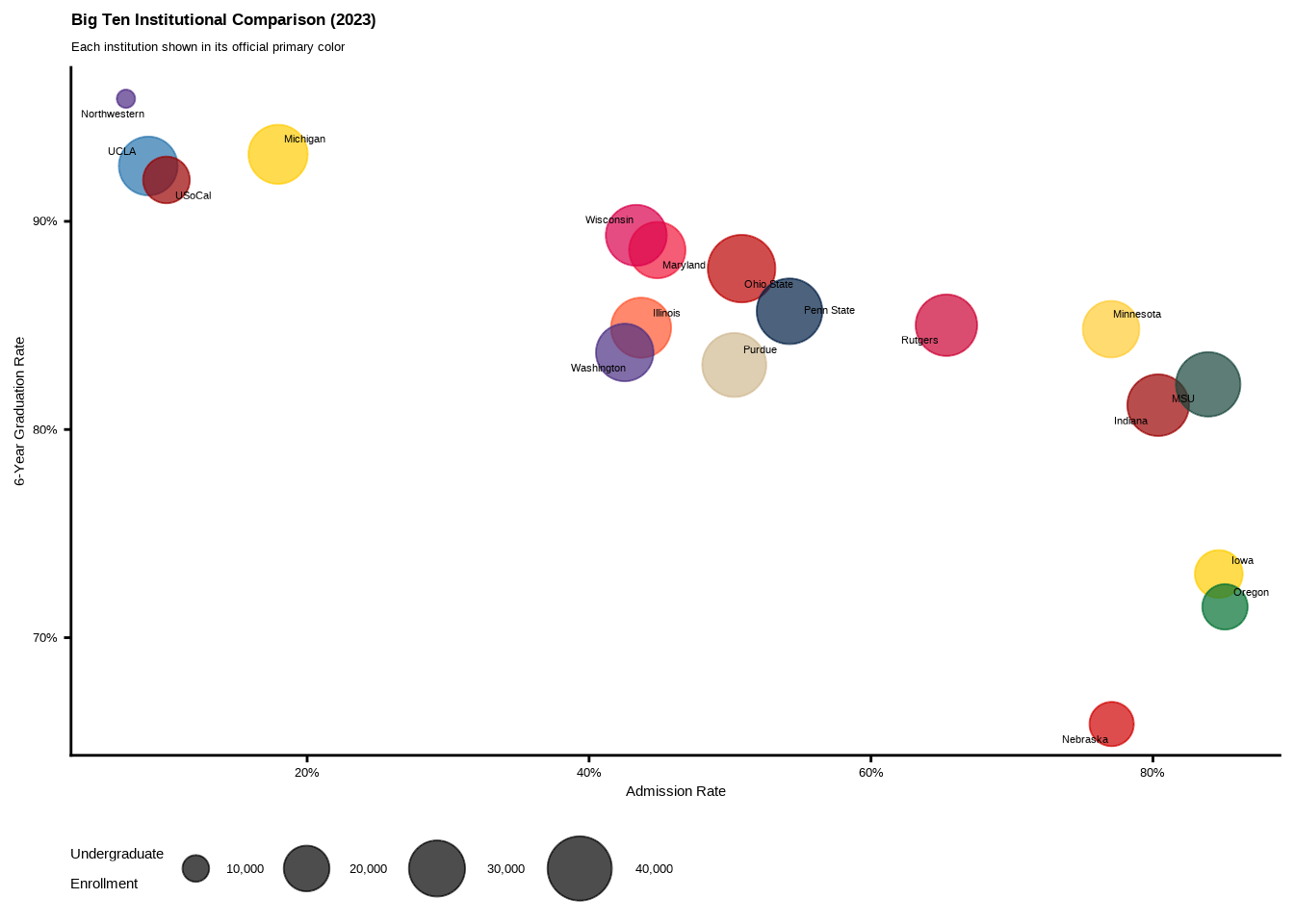
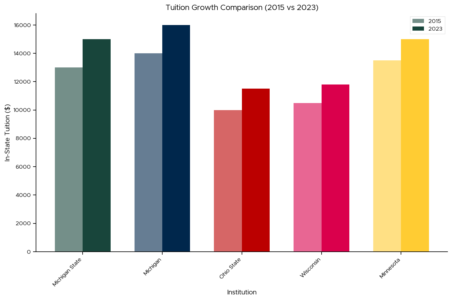
Big Ten Comparisons
When presenting Michigan State data in context—such as comparing tuition across Big Ten schools—consistent theming helps stakeholders focus on insights rather than being distracted by inconsistent visual styles:
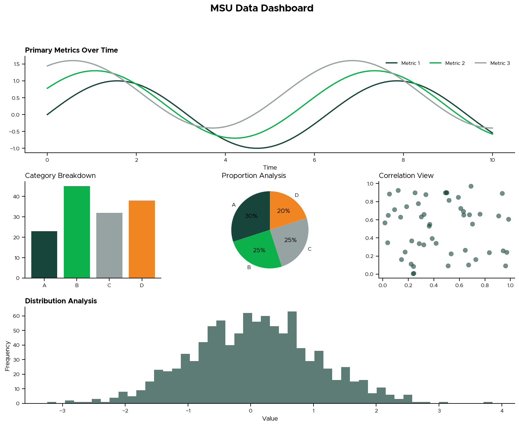
Dashboard Integration
Modern analytics often requires dashboards that combine multiple visualizations. Maintaining theme consistency across panels creates a cohesive analytical narrative:
Key Takeaways
Consistency Matters: Stakeholders develop visual literacy with your analytics over time. Consistent theming reduces cognitive load and allows them to focus on insights rather than adapting to new visual styles.
Cross-Platform Planning: If your organization uses multiple programming languages, invest in creating equivalent themes across platforms early. The upfront effort pays dividends in reduced friction during collaboration and handoffs.
Brand Alignment: Institutional branding isn’t just for PowerPoint—it extends to all analytical outputs and builds credibility with stakeholders who recognize attention to professional presentation standards.
Accessibility: When developing custom colour palettes, test for colorblind accessibility. Tools like ColorBrewer can help ensure your visualizations are readable for all audiences.
What’s Next?
Have you developed custom themes for your institution or organization? What challenges did you encounter in maintaining consistency across tools and team members? I’d love to hear about your experiences - and I’ll be sharing more thoughts on building effective analytics cultures in upcoming posts.
The MSUthemes packages are available for both R and Python. The visualizations shown here were developed during my work in the Office of the Vice Provost for Enrollment and Academic Strategic Planning at Michigan State University, demonstrating real-world applications of consistent theming across analytical workflows.